Plotting Results#
In this tutorial, we will:
explore the plotting functionality provided by LSDB
Introduction#
LSDB makes it easy to make astronomical plots from catalogs with a spherical projection. There are a number of built-in plotting functions that you can use with Catalog objects for this.
1. Load the catalog#
We will use Gaia DR3 catalog, limiting to just a few columns to reduce overall memory consumption.
Additional Help
For additional information on dask client creation, please refer to the official Dask documentation and our Dask cluster configuration page for LSDB-specific tips. Note that dask also provides its own best practices, which may also be useful to consult.
For tips on accessing remote data, see our Accessing remote data guide
[1]:
from astropy.coordinates import SkyCoord

import lsdb
import astropy.units as u
import matplotlib.pyplot as plt
[2]:
from dask.distributed import Client

client = Client(n_workers=4, memory_limit="auto")
gaia = lsdb.open_catalog("/epyc/data3/hats/catalogs/gaia_dr3/", columns=["ra", "dec", "phot_g_mean_mag"])
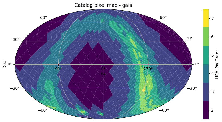
2. Plotting HATS HEALPix structures#
The first is plot_pixels which plots the HEALPix pixels that show the partitioning structure of how the catalog data is divided.
[3]:
fig, ax = gaia.plot_pixels()
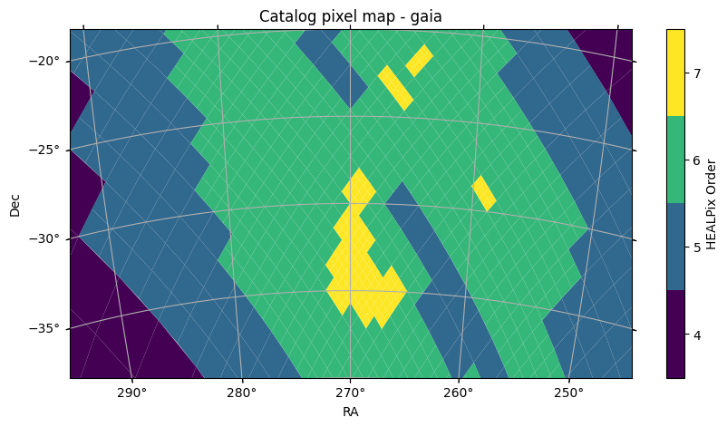
2.1. Limiting the field of view#
This functions plots the HEALPix pixels, showing their boundaries and the pixels colored by the HEALPix Order. This uses astropy’s WCSAxes and matplotlib to perform the visualization. By default, we plot with a Mollweide projection over the whole sky. This can be controlled by arguments passed to the function, such as projection, fov, or center, such as shown below, or a astropy WCS object can be provided with the wcs parameter for full specification of the projection. For full details on how to customize the plotting axes, see the API Documentation.
[4]:
fov = (40 * u.deg, 20 * u.deg)
center = SkyCoord(270 * u.deg, -30 * u.deg)
fig, ax = gaia.plot_pixels(projection="AIT", fov=fov, center=center)
3. Plotting points#
We can also plot the points of a catalog as a scatter plot with the same projected axes. This will compute the data in the catalog for the points within the field of view of the plot.
[5]:
fig, ax = gaia.plot_points(fov=20 * u.arcsec, center=center, color_col="phot_g_mean_mag")
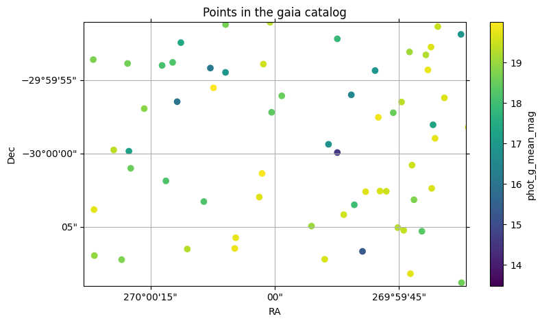
With this plot, we also see how a column can be used with a colormap to visualize the column values.
4. Multiple Plotting Calls#
When multiple LSDB spatial plotting calls are called, they all plot to the same axes. The first call initializes the axes with the given WCS parameters, and any further calls reuse these same axes and parameters. If you want to plot on different axes or figures, you can call plt.show() between plotting calls, or pass the ax or fig parameters to plot on a specific axes or figure.
[6]:
ztf = lsdb.open_catalog("https://data.lsdb.io/hats/ztf_dr14/ztf_object")
xmatched_cat = gaia.crossmatch(ztf)

xmatched_cat.plot_points(
    fov=200 * u.arcsec,
    center=SkyCoord(20 * u.deg, 10 * u.deg),
    c="red",
    marker="x",
    s=40,
    label="gaia points",
)
xmatched_cat.plot_points(
    ra_column="ra_ztf_dr14", dec_column="dec_ztf_dr14", c="green", marker="+", s=30, label="ztf points"
)
l = plt.legend()
/astro/users/mmd11/.conda/envs/importenv/lib/python3.10/site-packages/lsdb/dask/crossmatch_catalog_data.py:147: RuntimeWarning: Right catalog does not have a margin cache. Results may be incomplete and/or inaccurate.
  warnings.warn(
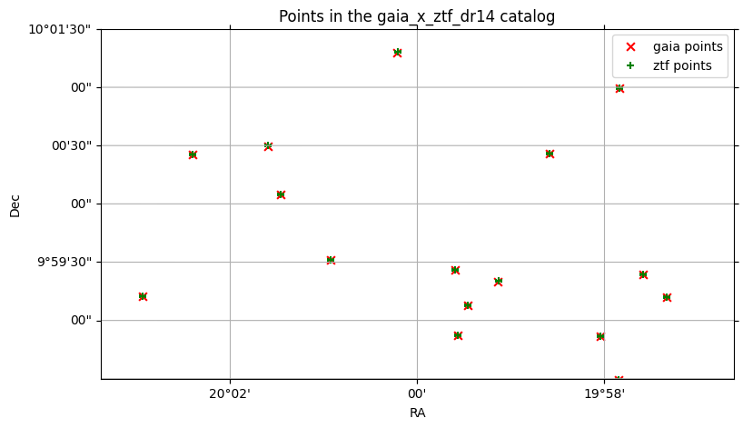
By default, the catalog’s main ra and dec columns are used to plot the points, but if there are multiple ra and dec columns, (for example, the right catalog in a crossmatch), these can be specified.
plot_points under the hood uses matplotlib’s scatter function, so any keyword arguments that work with scatter will work with plot_points.
5. Plotting aggregations of data#
You can also create a user-defined function to aggregate HEALPix pixels, either at a custom order, or the original order of the catalog data partitions.
See the tuturial on ``map_partitions` <https://docs.lsdb.io/en/latest/tutorials/pre_executed/map_partitions.html>`__ for more details on applying user-defined functions to all data partitions in a catalog.
For a simple example, to plot the number of points in each healpix pixel within a cone, you can do the following:
[7]:
import pandas as pd
from lsdb.dask.merge_catalog_functions import filter_by_spatial_index_to_pixel
import numpy as np


def per_pixel_len(df, pixel, target_order=10):
    if len(df) == 0:
        return pd.DataFrame(data={"pixel": [pixel], "len": [0]})
    # Within each data partition, divide into smaller partitions at `target_order`
    delta_order = target_order - pixel.order
    pixels = np.arange(pixel.pixel << (2 * delta_order), (pixel.pixel + 1) << (2 * delta_order))
    # Use np.vectorize to make the operation faster within each data partition.
    # In this case, we have a very simple lambda function to aggregate the data.
    lengths = np.vectorize(lambda p: len(filter_by_spatial_index_to_pixel(df, target_order, p)))(pixels)

    return pd.DataFrame(data={"pixel": pixels, "len": lengths})
[8]:
from lsdb import ConeSearch
from hats.inspection.visualize_catalog import plot_healpix_map
import hats.pixel_math.healpix_shim as hp

# Tune this to get more granular data
target_order = 11

cone_search = ConeSearch(center.ra.deg, center.dec.deg, 10 * 60)
cone_data = (
    gaia.search(cone_search)
    .map_partitions(per_pixel_len, include_pixel=True, target_order=target_order)
    .compute()
)

# Create an empty histogram of ALL pixels in the sky, and fill just where we have data
npix = hp.order2npix(target_order)
img = np.full(npix, -1)
img[cone_data["pixel"]] = cone_data["len"]

# Plot our values, zooming in on our cone search and highlighting the cone region with a red outline
plot_healpix_map(img, fov=(60 * u.arcmin, 30 * u.arcmin), center=center)
fig, ax = cone_search.plot(fc="#00000000", ec="red")
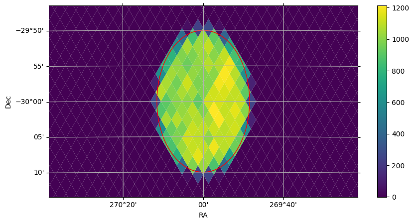
6. Plotting Search Filters#
In the plot above, we also see how search filters can be plotted with cone_search.plot(fc="#00000000", ec="red"). The plot function plots the correct shape of the filter on the spherical projection, with any additional kwargs passed to the creation of a matplotlib Patch object.
7. Histograms#
Suppose we want to bin observations in the Gaia DR3 catalog by magnitude in the G band. For a small area of the sky, we could pull it all into memory and use pd.DataFrame.hist, but to run the histogram across the entire catalog, we’ll need .map_partitions.
For a more detailed look on how to use .map_partitions, see Applying a function.
We’ll limit the catalog with a ConeSearch to begin with, so that we can test our approach with a smaller amount of data.
[9]:
import lsdb

# catalog_root = "https://data.lsdb.io/hats"
catalog_root = "/epyc/data3/hats/catalogs"
gaia3 = lsdb.open_catalog(
    f"{catalog_root}/gaia_dr3",
    margin_cache="gaia_10arcs",
    search_filter=lsdb.ConeSearch(ra=280, dec=-60, radius_arcsec=2 * 3600),
    columns=[
        "source_id",
        "ra",
        "dec",
        "phot_g_mean_mag",
        "phot_g_n_obs",
    ],
)
gaia3
[9]:
| source_id | ra | dec | phot_g_mean_mag | phot_g_n_obs | |
|---|---|---|---|---|---|
| npartitions=4 | |||||
| Order: 4, Pixel: 2944 | int64[pyarrow] | double[pyarrow] | double[pyarrow] | double[pyarrow] | int64[pyarrow] |
| Order: 4, Pixel: 2945 | ... | ... | ... | ... | ... |
| Order: 4, Pixel: 2946 | ... | ... | ... | ... | ... |
| Order: 4, Pixel: 2947 | ... | ... | ... | ... | ... |
7.1. All Within Memory#
First, what does it look like to do it all within memory? This slice of the catalog is small enough to do this.
[10]:
%%time
df = gaia3.compute()
df
CPU times: user 20.8 ms, sys: 7.41 ms, total: 28.2 ms
Wall time: 111 ms
[10]:
| source_id | ra | dec | phot_g_mean_mag | phot_g_n_obs | |
|---|---|---|---|---|---|
| _healpix_29 | |||||
| 3315212135629220059 | 6630424242158614528 | 279.475941 | -61.973682 | 20.157476 | 298 |
| 3315212197603296958 | 6630424379597543936 | 279.40738 | -61.977054 | 19.488537 | 346 |
| ... | ... | ... | ... | ... | ... |
| 3318663093295462547 | 6637326190180387584 | 280.426265 | -58.015067 | 21.097507 | 42 |
| 3318663093808668415 | 6637326185883831296 | 280.423503 | -58.013744 | 20.301455 | 336 |
469102 rows × 5 columns
Note that the four partitions become over 450k rows once they are computed. The lazily-loaded catalog can’t show you how many total rows there are before computing, only the number of partitions.
[11]:
from matplotlib import pyplot as plt
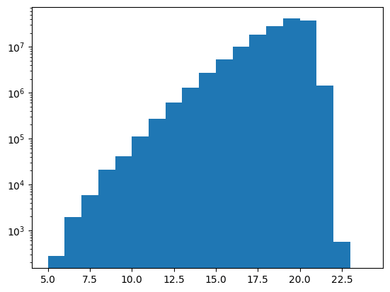
mag_bins = list(range(5, 25, 1))
display(len(mag_bins))
plt.hist(df["phot_g_mean_mag"], bins=mag_bins, weights=df["phot_g_n_obs"])
plt.yscale("log")
20
7.2 Across the Sky#
Now to move on to the whole catalog. We need to design a function that can operate independently on each partition. Each row of each partition contains some number of observations, and we want to sum these observations within each magnitude bin.
We’ll test this function on the same small piece of data before launching it across the entire catalog.
We will use this function to create partial histograms, a histogram for each partition, and we’ll need to reduce those down to a single histogram at the end. One consequence of this is the need to have the same number of bins in each partial histogram, mag_bins in this case. Often when producing a histogram, it’s common to let Pandas or pd.cut pick the bin boundaries given a number of bins, but that will work against us in this case, since each partition will have a different min and
max, and the partial histograms won’t reduce.
[12]:
# This function only requires and returns one DataFrame: no pixel
# argument, no additional arguments.
def observation_histogram(df):
    df["binned"] = pd.cut(df["phot_g_mean_mag"], mag_bins)
    binned_data = df.groupby("binned", observed=True)["phot_g_n_obs"].sum()
    return pd.DataFrame(binned_data)
Test our new function on our single in-memory DataFrame, df, to verify that we get the results we expect.
[13]:
%%time
import matplotlib.pyplot as plt
import numpy as np
import pandas as pd
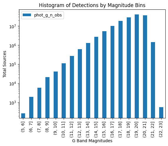
fig, ax = plt.subplots()
bd = observation_histogram(df)
bd.plot(kind="bar", ax=ax, label="Observations")
ax.set_title("Histogram of Detections by Magnitude Bins")
ax.set_xlabel("G Band Magnitudes")
ax.set_ylabel("Total Sources")
ax.legend()
ax.set_yscale("log")
plt.show()
CPU times: user 150 ms, sys: 12 ms, total: 162 ms
Wall time: 170 ms
7.2.1 Using map_partitions#
Next, exercise this function with map_partitions, on the original catalog, which has been limited by a cone search to keep it tractable.
[14]:
%%time
result = gaia3.map_partitions(observation_histogram).compute()
result
CPU times: user 37.6 ms, sys: 878 μs, total: 38.5 ms
Wall time: 111 ms
[14]:
| phot_g_n_obs | |
|---|---|
| binned | |
| (8, 9] | 2811 |
| (9, 10] | 4784 |
| ... | ... |
| (20, 21] | 11124220 |
| (21, 22] | 493954 |
65 rows × 1 columns
The above contains a histogram for each partition. We need to do a final reduction step to get the complete histogram, grouping by "binned".
[15]:
total_histogram = result.groupby("binned", observed=True).sum()

import matplotlib.pyplot as plt

fig, ax = plt.subplots()
total_histogram.plot(kind="bar", ax=ax)
ax.set_title("Histogram of Detections by Magnitude")
ax.set_xlabel("G Band Magnitude")
ax.set_ylabel("Sum of Detections")
ax.set_yscale("log")
plt.show()
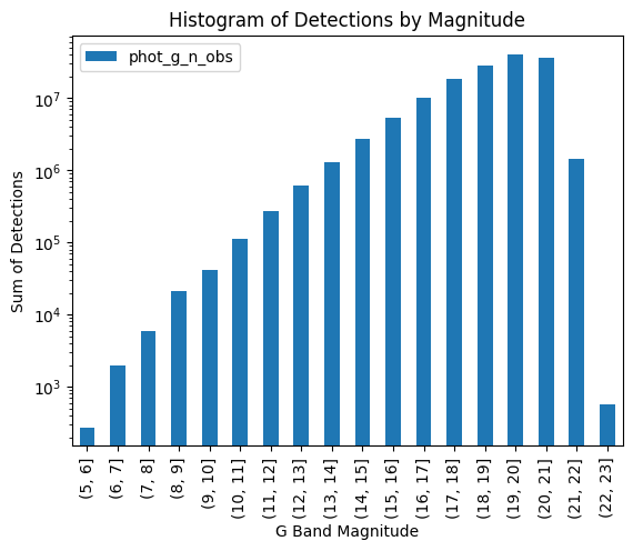
This gives us confidence because it matches what happened when we applied our function to the in-memory df that resulted from calling .compute() on our cone search. Now we can confidently apply it to the entire catalog:
[16]:
gaia3 = lsdb.open_catalog(
    f"{catalog_root}/gaia_dr3",
    margin_cache="gaia_10arcs",
    columns=[
        "source_id",
        "ra",
        "dec",
        "phot_g_mean_mag",
        "phot_g_n_obs",
    ],
)
unrealized = gaia3.map_partitions(observation_histogram)
display(unrealized.npartitions)
3933
[17]:
%%time
# Takes a few minutes on epyc, using local catalog root
result = unrealized.compute()
# This is actually the histogram repeated for each partition.
result
CPU times: user 6.92 s, sys: 156 ms, total: 7.07 s
Wall time: 21.1 s
[17]:
| phot_g_n_obs | |
|---|---|
| binned | |
| (5, 6] | 3297 |
| (6, 7] | 7250 |
| ... | ... |
| (21, 22] | 4548691 |
| (22, 23] | 7823 |
64599 rows × 1 columns
Again, the final reduction and plot.
[18]:
total_histogram = result.groupby("binned", observed=True).sum()

import matplotlib.pyplot as plt

fig, ax = plt.subplots()
total_histogram.plot(kind="bar", ax=ax)
ax.set_title("Histogram of Detections by Magnitude")
ax.set_xlabel("G Band Magnitude")
ax.set_ylabel("Sum of Detections")
ax.set_yscale("log")
plt.show()
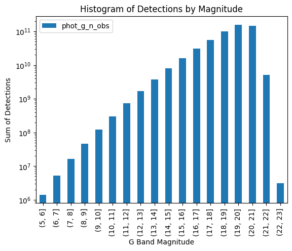
The histogram has the same shape but larger values on the Y-axis: our small cone search had picked a part of the sky which was representative of the whole, but processing the entire catalog increased the number of observations across all bins.
Close our Dask client now that we’re done with it.
[19]:
client.close()
About#
Authors: Sean McGuire
Last updated /verified on: October 27, 2025
If you use lsdb for published research, please cite following instructions.